In last week's post about the Rule of Thirds (click HERE) we discussed one of the simplest ways to improve our photography. This week we're going to explore it a little further and see one of the reasons why it works.
When photographing a moving object, make sure it has room to move within the frame, otherwise the image will have a choked feeling. The rabbit below is a good example of this. When I originally framed the photo he was on the right vertical third line, but he spotted me and moved. I moved with him but couldn't recompose the photo properly because of the plant to the left of the image. The resulting image is of a baby bunny, ready for flight but with nowhere to go.
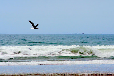
This photo, of a Black-Backed Seagull, is a better example of allowing space for the subject. The bird is on the top left line-intersection, which gives it two-thirds of the photo to move on its flight path. He looks a lot more comfortable and free than the bunny!
These next two photos were taken when I was using a film camera and show how you can create curiosity in the viewer. We wonder what has caught their attention so strongly. The little dog is looking at something on the other side of the frame, while the kitten - typical for his type - is so captivated that he ignores the photographer and focuses on something completely separate from us as viewers.
Although the we've observed the Rule of Thirds and have placed the kitten on the top right line-intersection, he is looking out of the closest edge of the frame rather than looking across the image. We've broken the rule of giving space for the subject to move, but it doesn't feel awkward as it did with the bunny. The black and white bands of the stairs give a feeling of imprisonment, which the kitten is completely ignoring, fascinated by something we can't see.
So there you have it. Rules are meant to be followed - and broken when it creates a good image. The best way to discover what works and what doesn't is to get out there and experiment. The joy of digital is that it doesn't cost anything to learn from a bad photo!


2 comments:
I really liked your composition on the dog. The shallow depth of field really appeals to me.
Thanks Craig - and I'm planning on covering depth of field in a future post :o)
Post a Comment